
By Bethlyn Krakauer
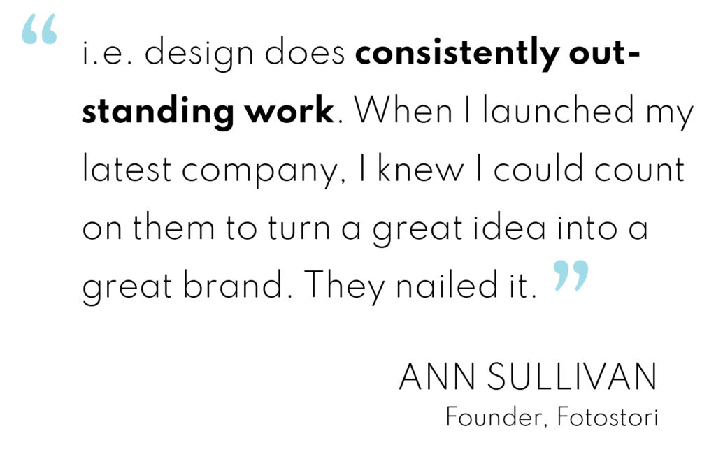
Fotostori is the brainchild of Ann Sullivan, CPO®, CPM®, the acclaimed home organization guru who’s been an i.e. design client for years. The curation of her own clients’ treasured images, audio recordings, and films was already part of her successful business. But the demand for her unique approach was so great, she decided to create a whole new company dedicated to this specialized archival work. Ann looked to us to name the new company, establish a distinctive brand, and create the website.
We had many ideas.
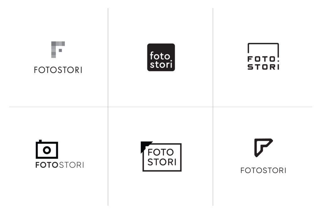
The brand needed to clearly communicate the company’s essence – a trusted team of professionals with an uncompromising eye and attention to detail. The development of a unique URL was as important as the brand name itself. Our search process was extensive. Fotostori emerged as an early favorite. We loved the name both for its simplicity and the playful spelling.
During the initial design phase, we explored a range of approaches representing photos, photo books, cameras, and digital technology. We knew we wanted a modern, clean execution that conveyed the company’s streamlined process. The mark we ended up going with is inspired by the classic, familiar photo corner. It also alludes to the “F” in Fotostori.
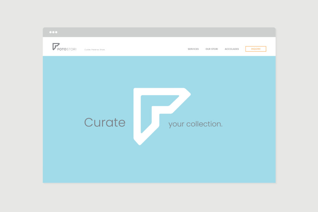
Fifty shades of blue. Well, almost.
Ann knew from the start that she wanted to use some shade of blue as the main brand color. This would help differentiate Fotostori from her organizing business brand, which is based on a vibrant green. We asked her to share images of anything at all that inspired her. She brought us a range of examples – everything from wall colors to cars. All were very distinct from one another, launching us into the extensive hunt for the perfect blue. No Pantone hue was quite right, so we experimented with customized colors achieved through a combination of print and digital formulas. We tested over a dozen different blues in print before settling on a shade that perfectly worked across the board.

The process in a tagline.
A tagline should tell a story. We distilled Fotostori’s archiving process down to “Curate. Preserve. Share.” This served as the basis for the wireframe of the website. The design and copywriting style reflect the high-end nature of the company, as well as its elite clientele.
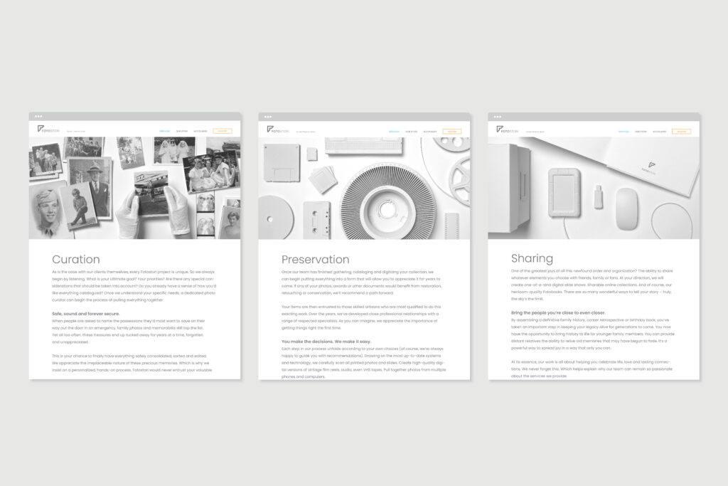
Everyday objects as art.
Knowing that our client is a minimalist, we chose to represent Fotostori’s white-glove service with clean, elegant, black and white photography. A monotone palette was developed to create images for the Preservation and Sharing pages. Common objects related to the process were painted white, elevating them into unified and orderly compositions.
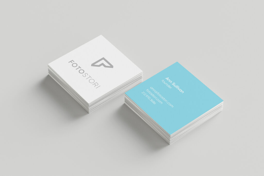
Brand style expressed in a premium business card.
First impressions matter. A square format helps Fotostori’s business cards stand out while the triple layered, luxury textured cover stock exudes ultra-premium quality.
Bethlyn Krakauer is i.e. design’s Founder and Creative Director.