
By Bethlyn Krakauer
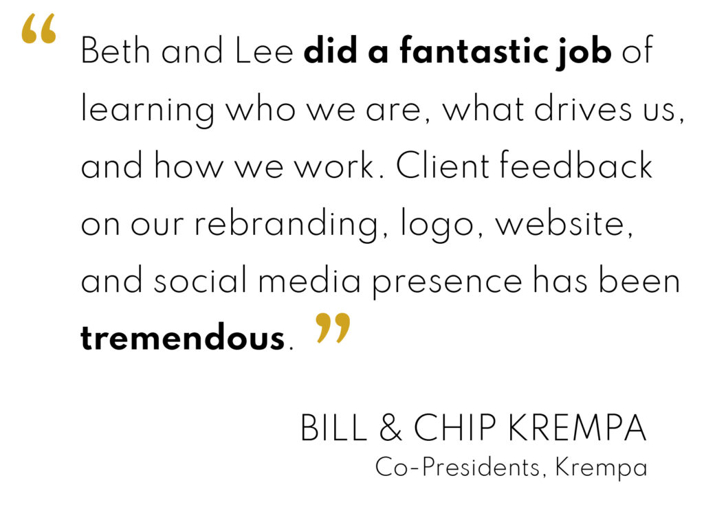
Krempa has a 50-year legacy providing financial guidance to families and companies throughout Philadelphia’s Five County region. Owners Chip and Bill Krempa came to us for a brand refresh and website to carry them forward into the next chapter of their business.
The first step was determining whether or not to change the company’s name. As second-generation owners, the two brothers were beginning to contemplate a succession plan to set the company up for success after their own retirement. They asked us to consider a name that wasn’t tied directly to them.
As we got to know Bill and Chip, we came to appreciate the strong, personal nature of the long-term relationships that characterized their business. It became clear that there was a great deal of equity in the Krempa name. To simplify and modernize the brand without losing valuable brand equity, we dropped “Associates,” allowing us to capitalize on the strength of the shorter (and already secured) Krempa.com.
Along with simplifying the name, we introduced a new tagline incorporating the date of the company’s inception.
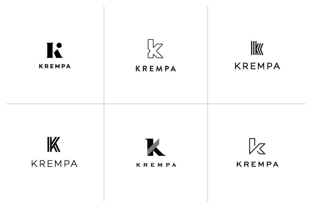
We started with several concepts.
Influenced by the established legacy of the Krempa name, we focused on bold simplicity. Concepts ranged from unique icons based on “K” letterforms to morphing the “K” into a griffin, symbolizing the company’s fierce protection of client assets.
Adding warmth to the brand.
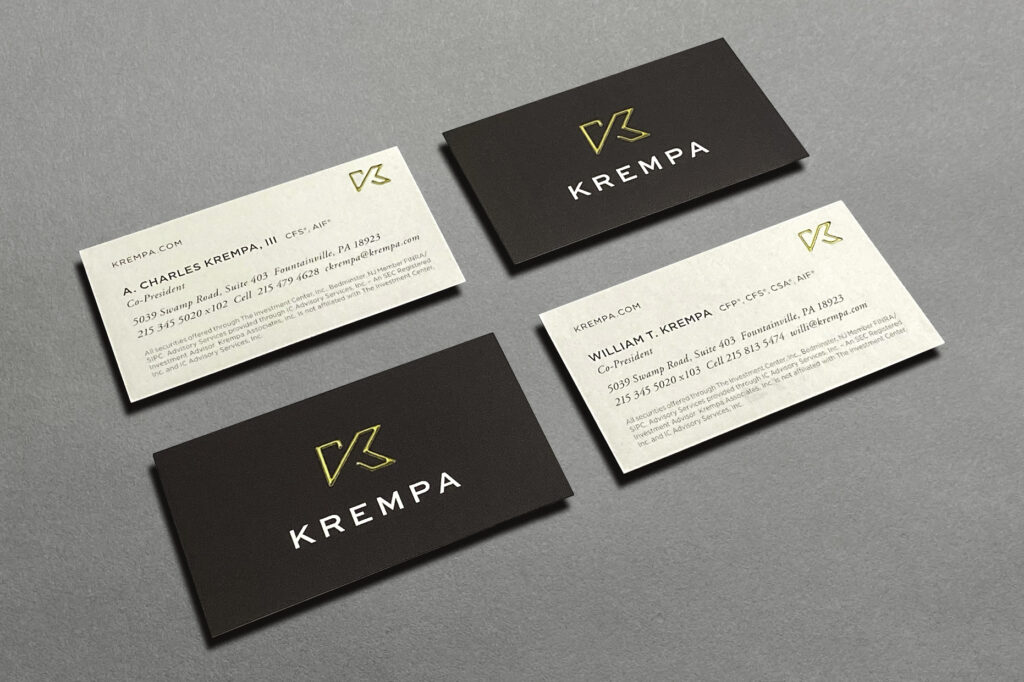
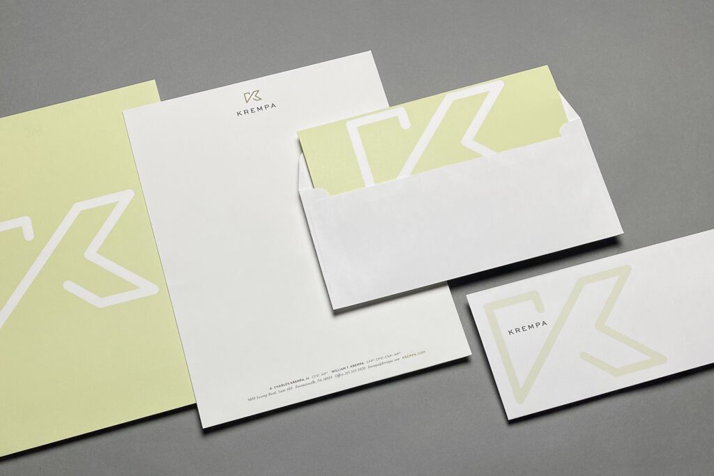
We chose rich metallic gold and deep charcoal to create a cohesive, upscale stationery package. A bold, oversized icon knocks out from a custom, cream tone on the back of Krempa’s letterhead and indicates exactly where to fold the page into perfect thirds.
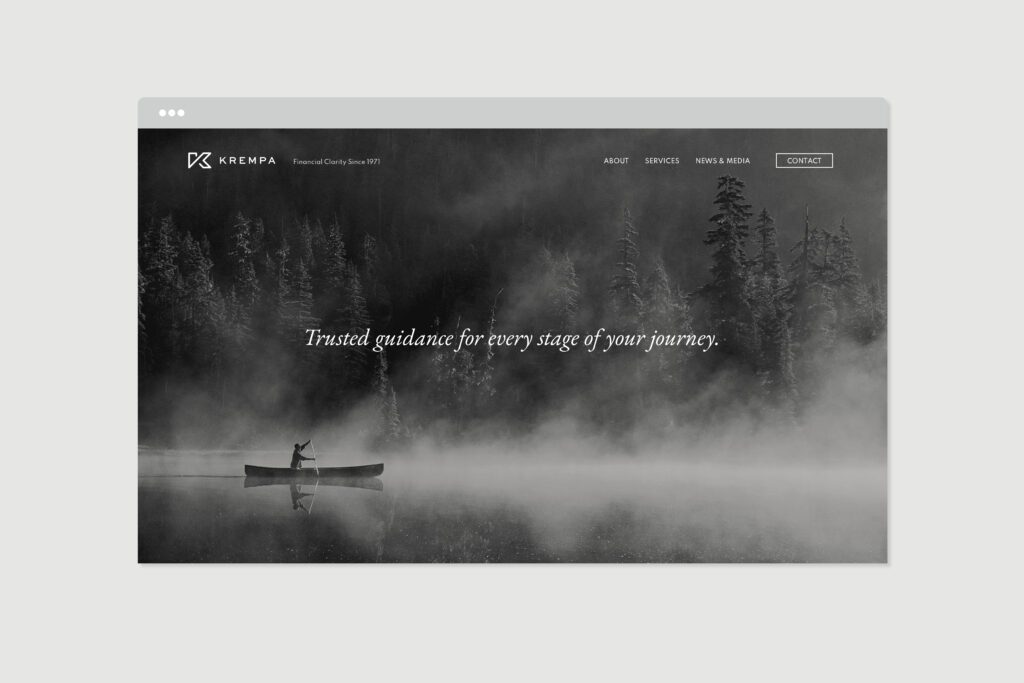
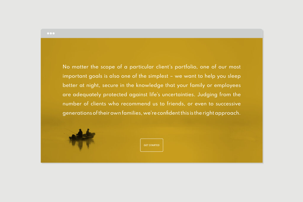
A picturesque website reflects Krempa’s confidence and love of nature.
We’re always looking and listening to keenly understand what drives our clients. During our weekly Zoom meetings, we couldn’t help but take note of the personal environments Bill and Chip had created in their offices. Photos and artwork clearly showed that both have a passion for nature. As we got to know them better, we learned that both enjoy sharing many outdoor activities and adventures with their families.
This inspired us to choose serene, majestic, black and white photography as a design theme. As expansive as the effect is, we also saw it as an opportunity to invite a bit of introspection. Life is a journey, and we wanted the viewer to imagine being in these thoughtful scenes as a metaphor for planning the path ahead. As a bonus, the black and white photography helps the firm stand out within a crowded field of financial advisor sites.
Bethlyn Krakauer is i.e. design’s Founder and Creative Director.