Berwyn
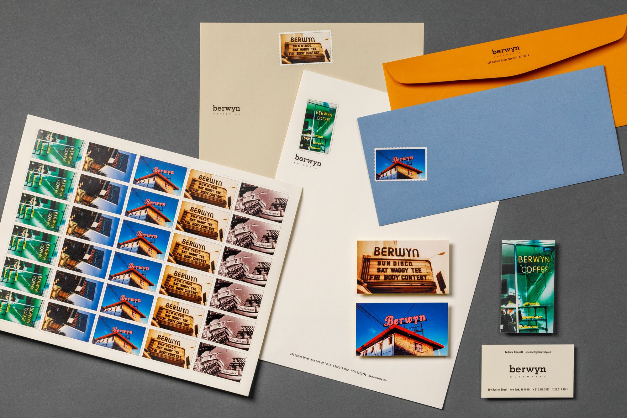
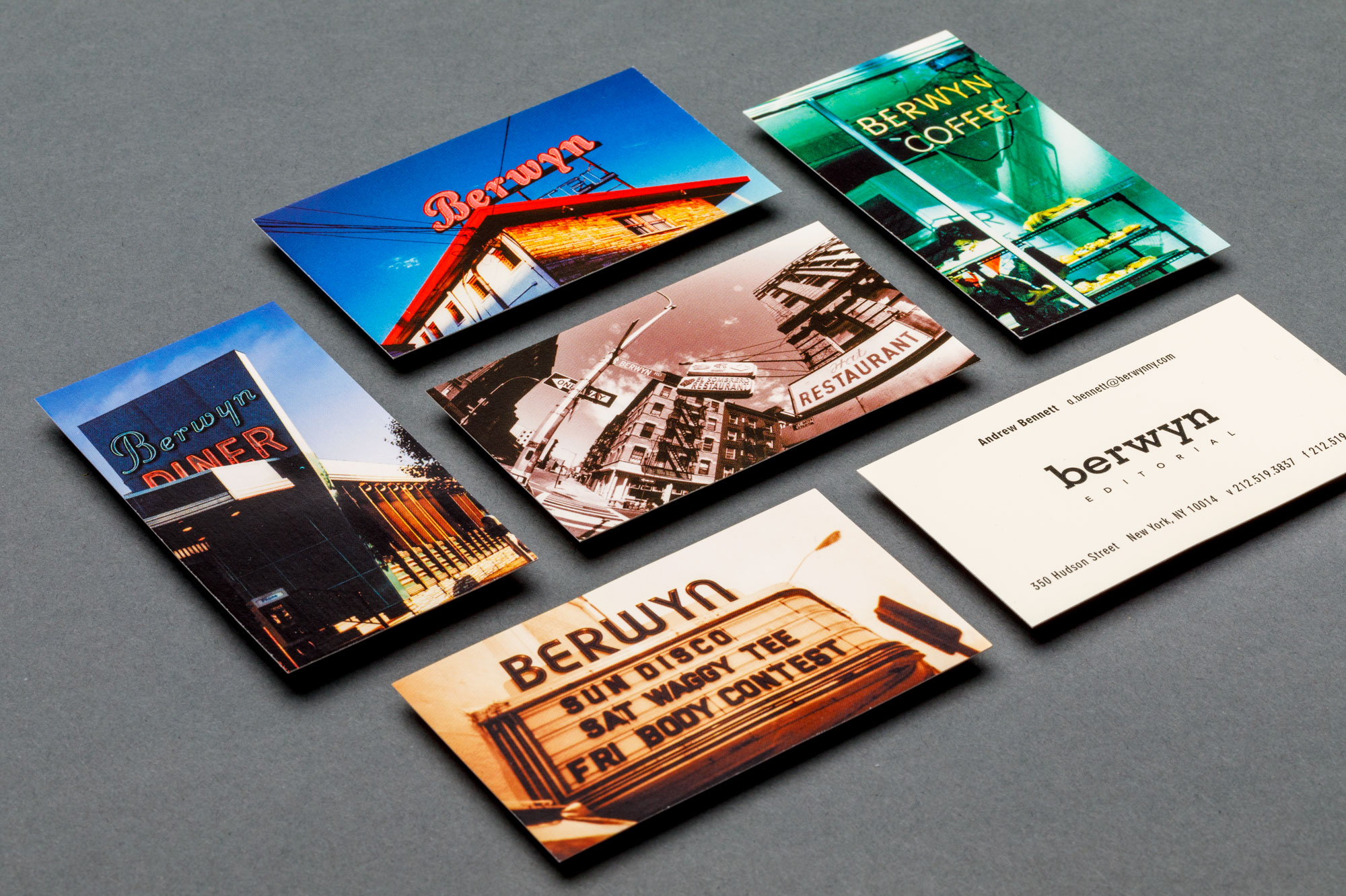
Having spent his entire childhood making films, this company’s founder named his agency after the street on which he was raised. With a history like that, we had to elevate Berwyn to landmark status. Using custom photography and master manipulation, we created a flexible sticker system that is interchangeable with multi-colored paper stocks. Employees are encouraged to design their own communications and get a complete series of award-winning business cards to choose from.
Industry: Film, Television, Video Production
K2 KRUPP
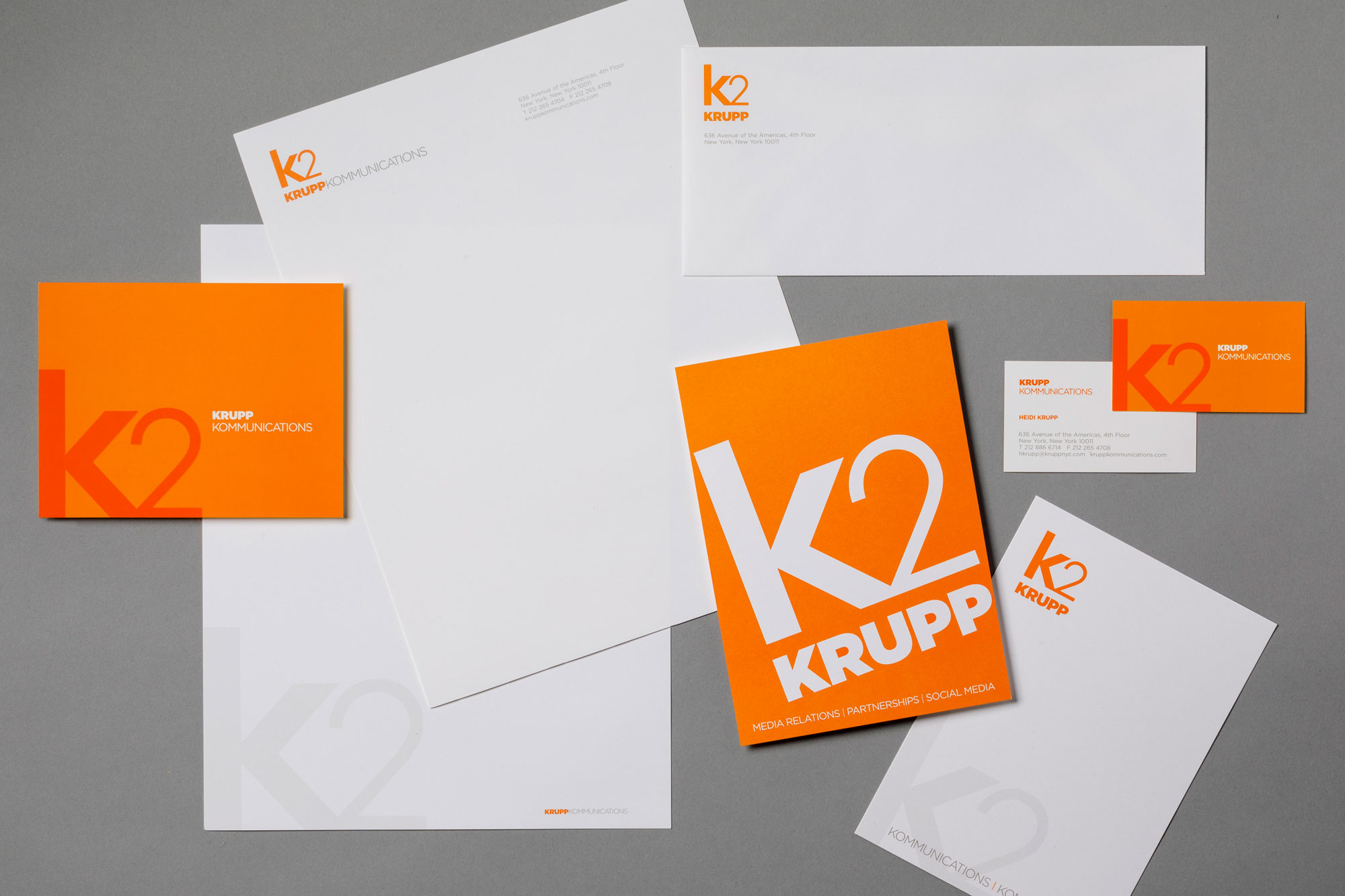
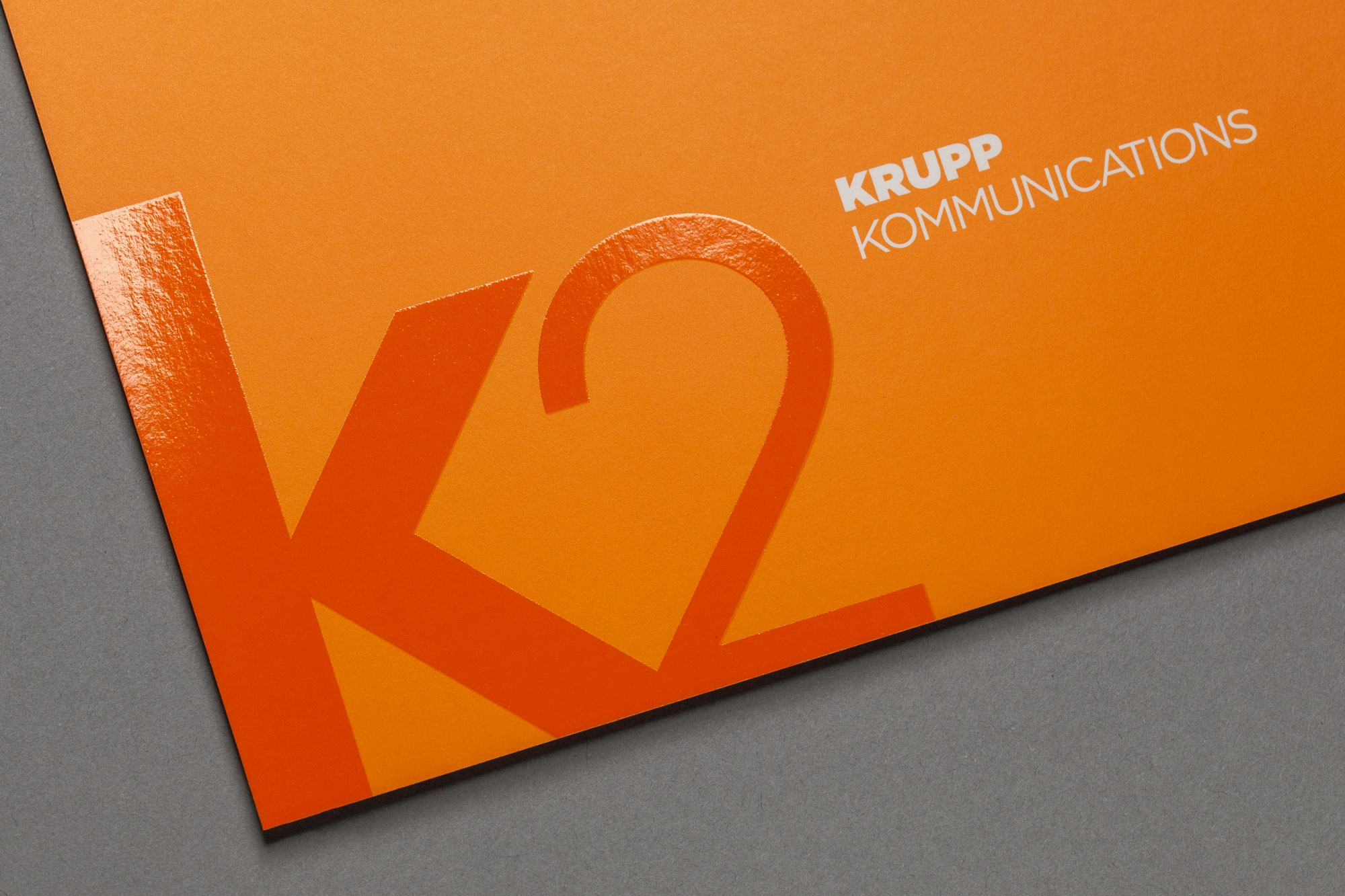
This award-winning, New York City public relations and marketing agency has a successful track record in igniting brands from start-ups, new authors, and celebrities by connecting them with cultural trends and influencers. When it came to representing their brand, K2 came to us. Bold, vibrant, and dynamic, this timeless identity system reflects the founder’s favorite color and the company’s energetic culture and environment.
Industry: Public Relations & Marketing for Media
WHYM
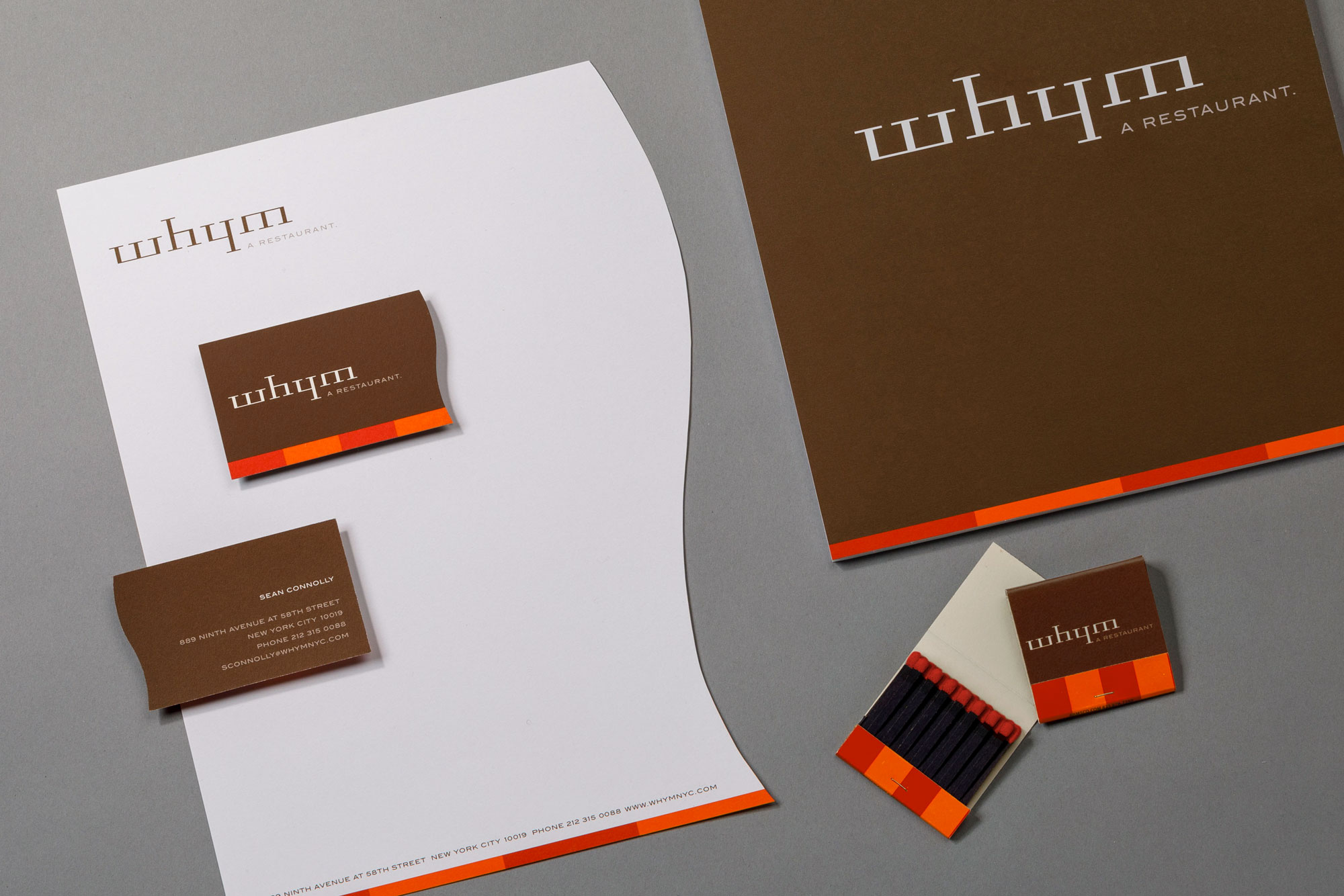
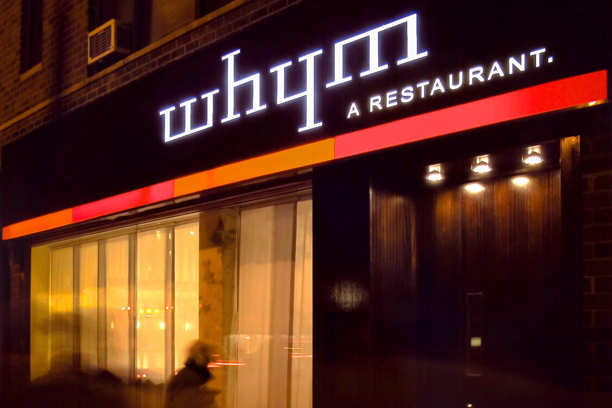
After successfully branding their first eatery, this client returned to us to realize their dream of an upscale, Upper West Side eating destination.
The custom letterform is a whimsical play on their unique spelling and can read upside down. The vibrant color palette was developed in partnership with the interior architecture team to create a warm and exciting atmosphere. The custom die-cut edge of the identity system mimics the curve of the unique, showcase bar.
Industry: Restaurant & Bar
Ann Sullivan
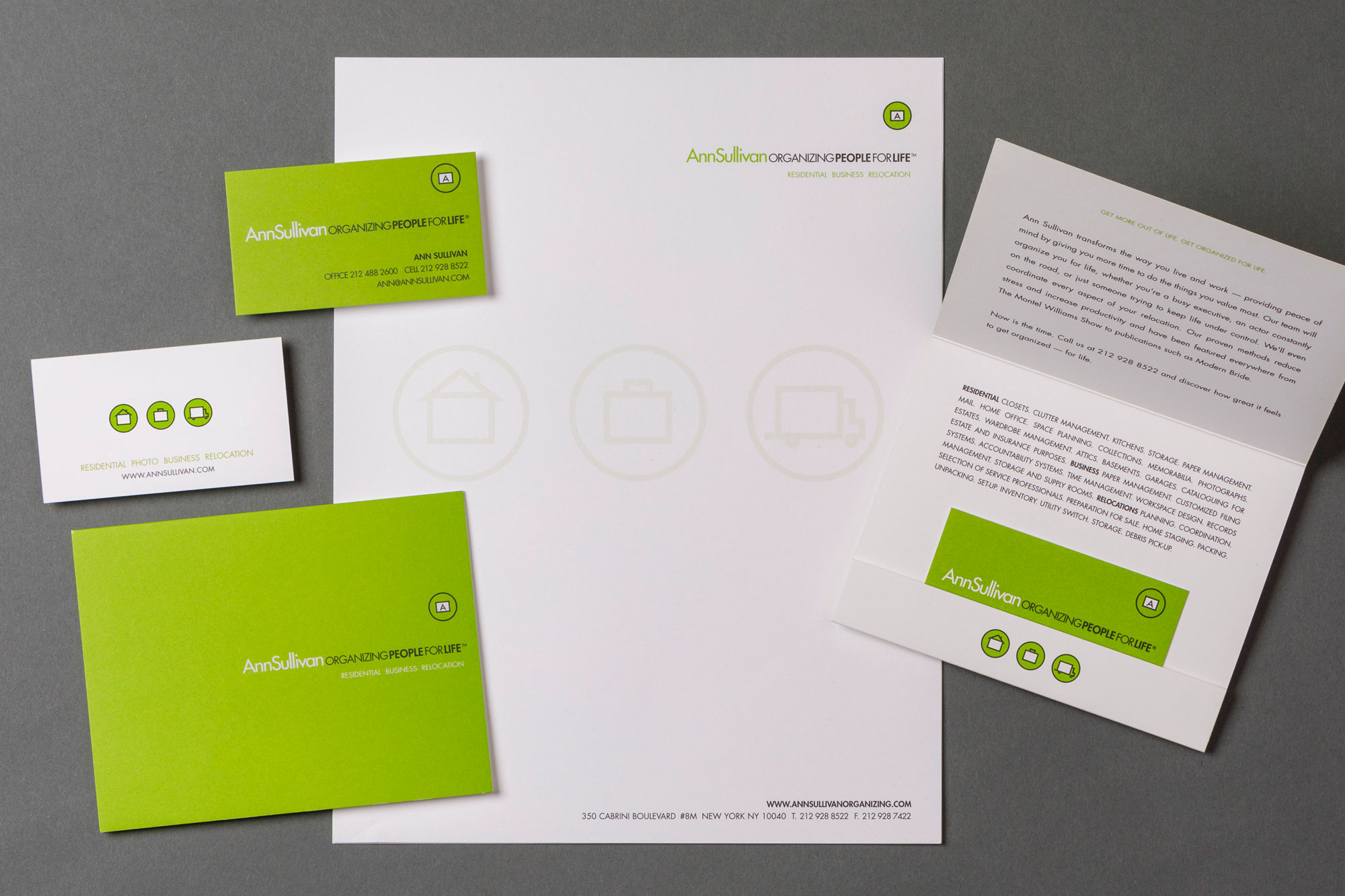
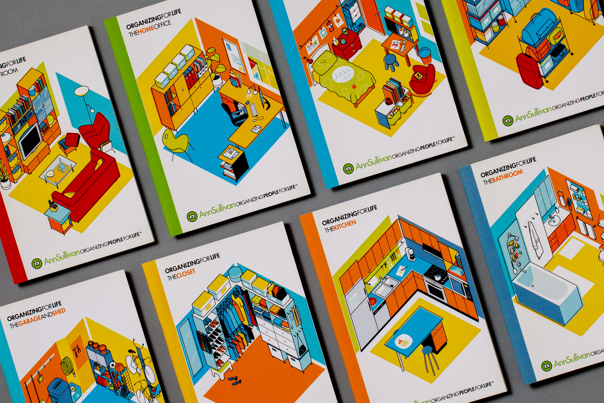
Ann dreamed of being “the Oprah” of organizing. We established her name as the brand and created a tagline, which reflected the peace of mind that her clients get from having and maintaining an organized life. The simple icon series represents each area of expertise. As the company’s services have expanded over the years, the identity system has evolved along with it and remains as fresh as it was day one.
Industry: Professional Organizing
LOA
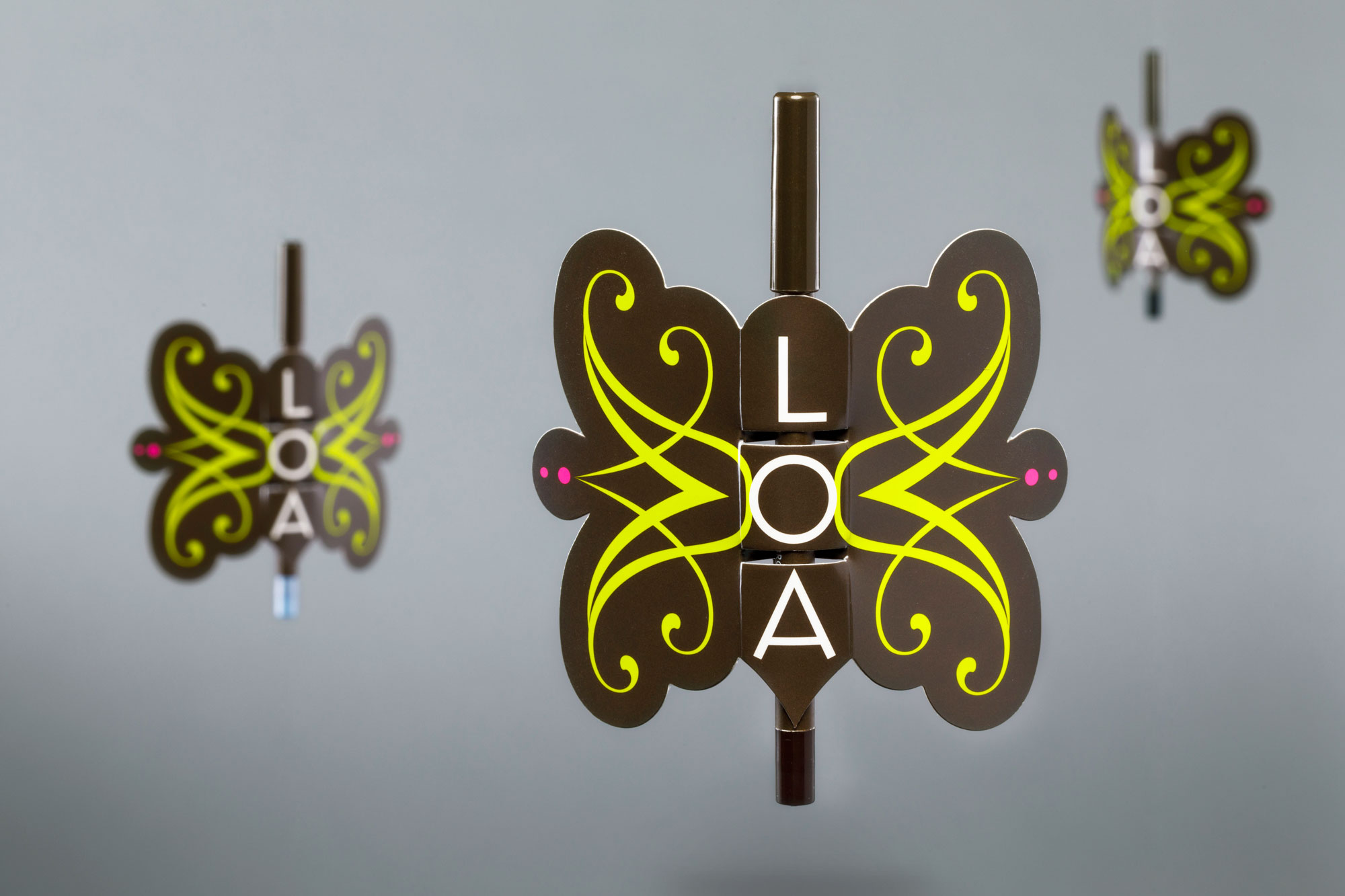
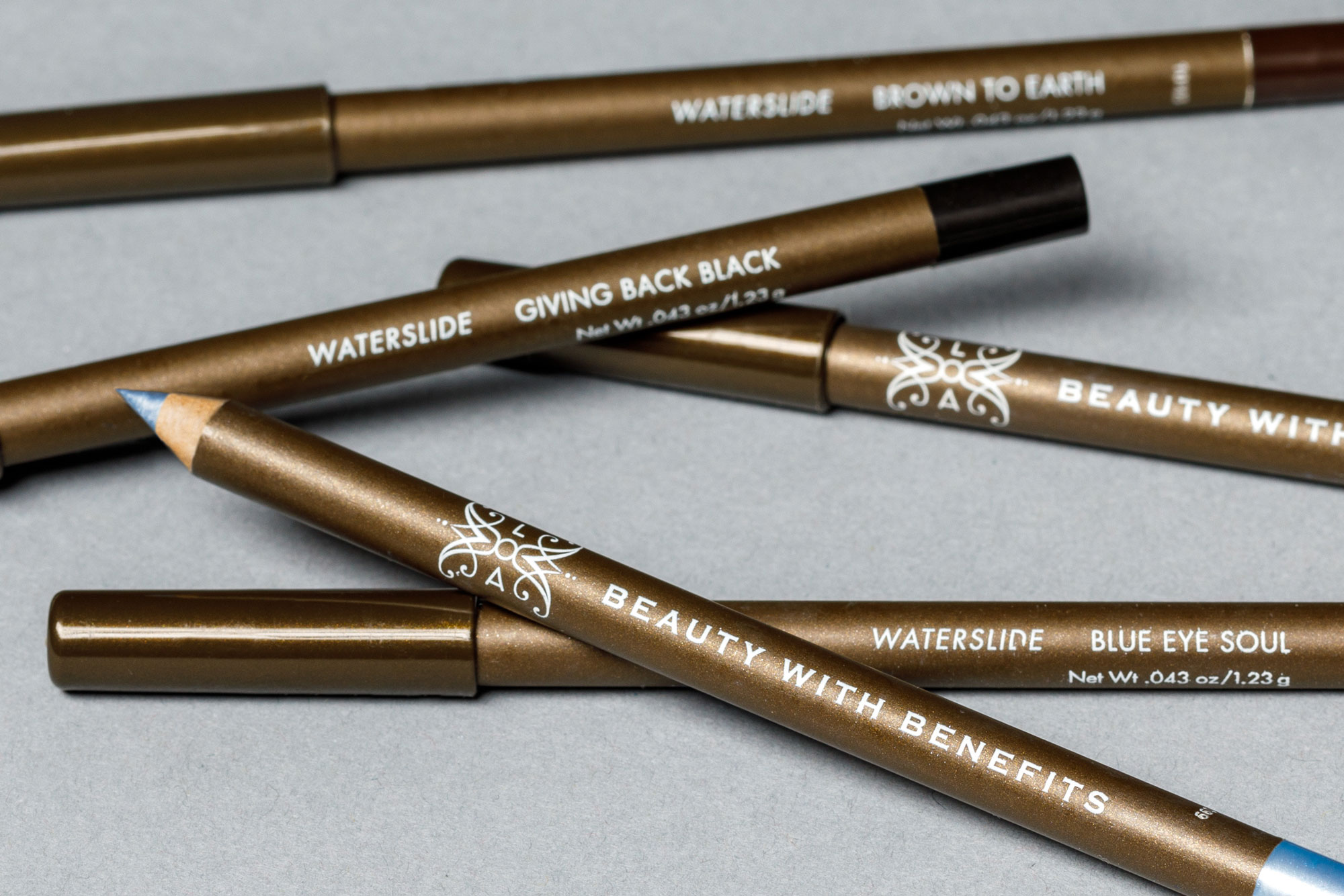
This professional make-up artist team came to us to brand their patented “waterslide” eye pencil. Color names like “Giving Back Black,” reflect the company’s commitment to providing makeovers for women facing health challenges. The playful packaging elevates a staple product to gift worthy and generates attention in a saturated market by flying above its display case. The motif holds special meaning for the founder who shared with us that the butterfly is a sign that her beloved mother is still with her.
Industry: Beauty & Cosmetics
WET
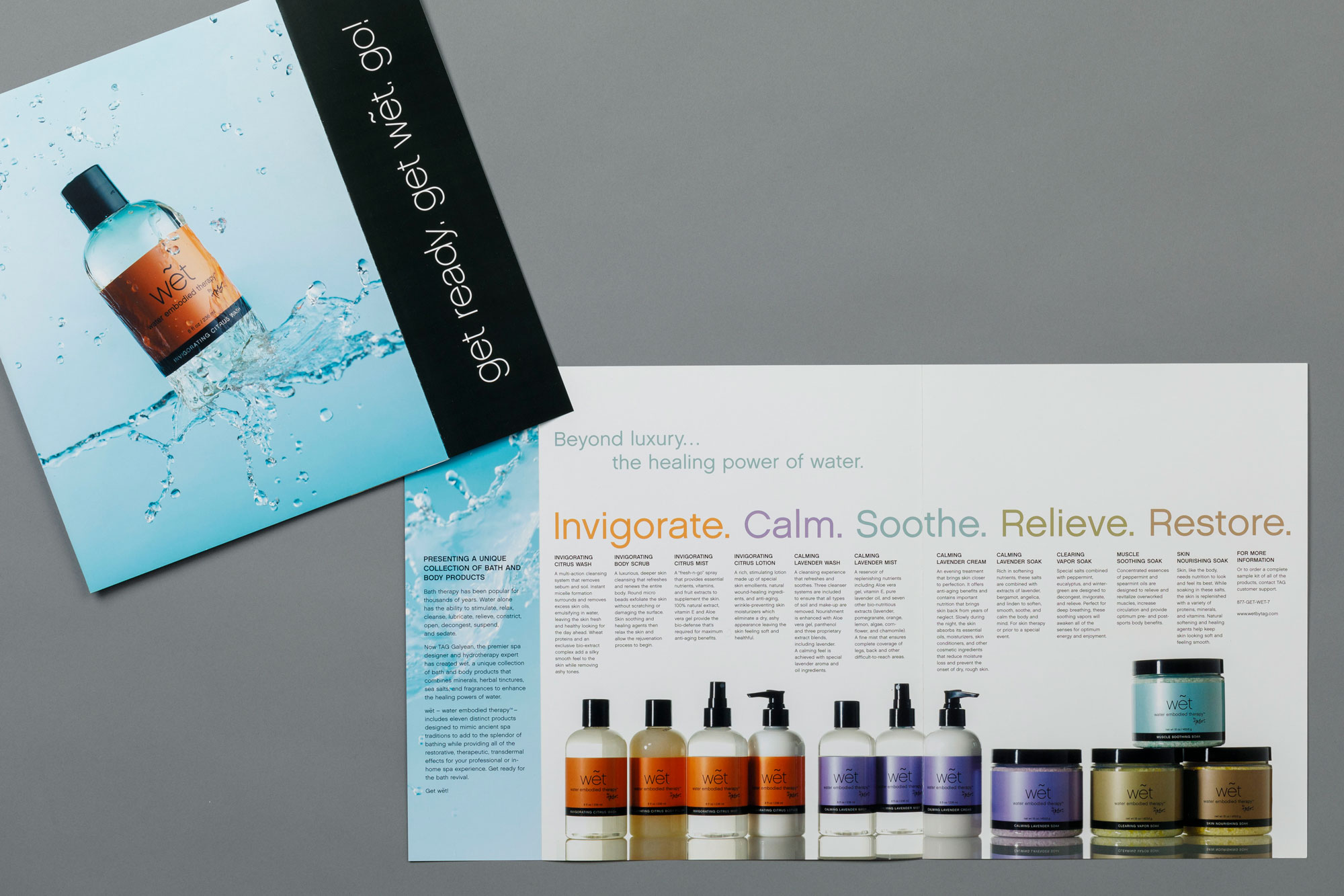
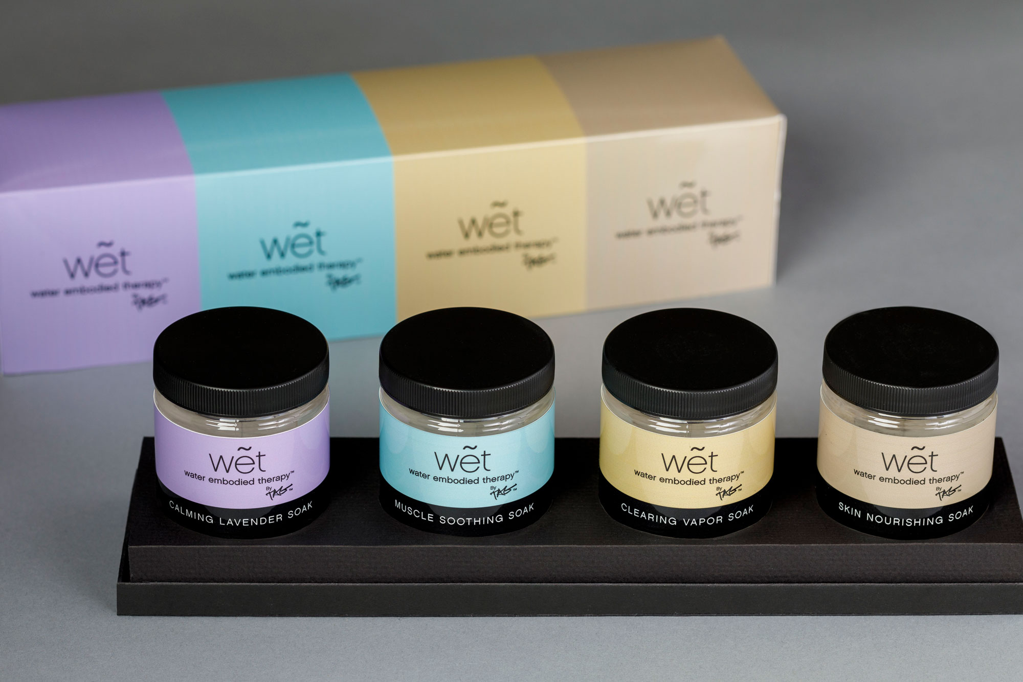
This Master Architect and world-renowned spa designer used his reputation and expertise in hydrotherapy to launch an exclusive product line for luxury hotels and resorts. A soothing, muted color palette was designed to reflect the scent profile of each series of scrubs and lotions. Authentic water splash photography set the tone to promote the health benefits and art of bathing. The package design expanded to gift and travel sets that invite guests to take the luxury experience home.
Industry: Health & Wellness Spas
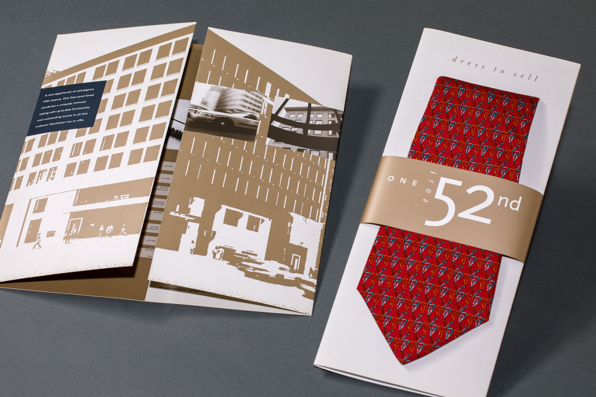
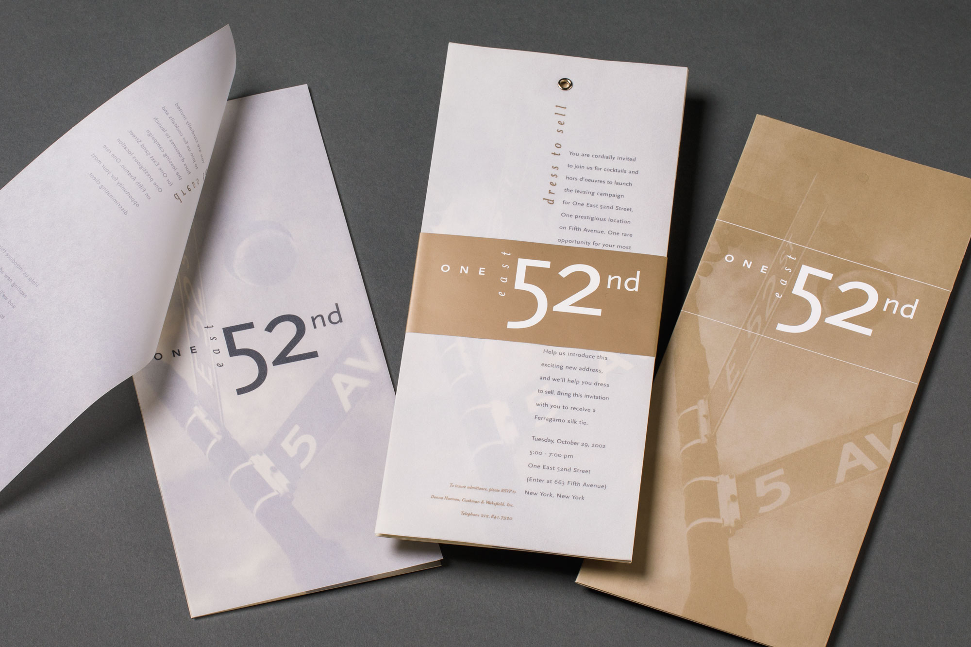
Ferragamo
Tasked with marketing office space above this luxury brand’s Fifth Avenue flagship, we faced the challenge of an unknown, side street entrance. Handed nothing more than an architect’s rendering, we elegantly branded the address, captured the energy of the location, and generated enough buzz to expand the viewing party to two dates by luring brokers with the promise of a Ferragamo tie. The results were a quick closing and a feature article in Crain’s NY Business citing our innovation and success in a challenging real estate market.
Industries: Luxury Fashion, Real Estate
