
By Bethlyn Krakauer
America’s Grow-a-Row impacted my family long before I ever worked with them professionally. Years ago, my kids and I volunteered in their fields, harvesting cabbage and planting seeds alongside classmates. Even then, what stood out wasn’t just the work, but the heart behind it. America’s Grow-a-Row felt both personal and purposeful.
So when Jackie Etter, Senior Director of Development and Marketing, called years later with what seemed like a simple request — “Can we make the word ‘America’s’ bigger in the logo?” — I knew this moment mattered. Not because of the logo, but because of what the question represented.
It’s not unusual for organizations to come to us asking to fix what they believe is the problem. When you live with a brand every day, it’s hard to see what’s no longer serving you, especially when it carries history and meaning.
Jackie was right. Something was getting lost. But as experienced designers, we could see that enlarging a word wouldn’t solve the real issue. America’s Grow-a-Row had grown significantly, and its brand hadn’t kept pace.
That realization takes honesty. Acting on it takes trust.
The organization had grown nationally, but the brand still spoke locally.
AGAR had evolved into a nationally respected nonprofit. Over the years, they have donated more than 100 million servings of fresh produce, operate 423 acres in Hunterdon County, New Jersey, and distribute food across 29 states through all five New Jersey food banks as well as Feeding America. They partner with organizations such as B&G Foods, Bayer, Bank of America, Prudential, AmeriHealth, Horizon, QuickChek, The Tepper Foundation, and the list goes on. Yet visually, the brand still spoke in the language of its earliest days — grassroots, informal, and local.
When a mission outgrows its visual system, the brand must evolve.
The concern wasn’t looking corporate. It was credibility, clarity, and consistency with partners, funders, vendors, and the communities they serve. Strong missions don’t fail because they lack heart. They lose momentum when their systems don’t support their growth.
From the beginning, one thing was clear: the original logo was Chip Paillex’s “baby.” Founded in 2002 as a father-daughter project, America’s Grow-a-Row began when Chip planted a small garden with his four-year-old daughter, Kyra. A chance interaction with a local food pantry revealed how desperately fresh produce was needed, and that moment changed the trajectory of Chip’s life and AGAR forever. That first year, the garden yielded just 120 pounds of produce. Today, AGAR donates more than 4.2 million pounds annually.
The corn-and-heart mark reflected that origin. It held more than twenty years of equity and community trust. Our role was never to replace it. Our role was stewardship.
We were holding Chip’s heart in our hands, and we took that responsibility seriously. Before redesigning anything, we talked with the people using the logo every day. What we heard was consistent — poor readability at small sizes, difficulty reproducing the logo across vendors, inconsistent colors and type treatments. There was no clear guidance, which led to workarounds and lost opportunities. That’s when you know a brand has quietly outgrown its tools.
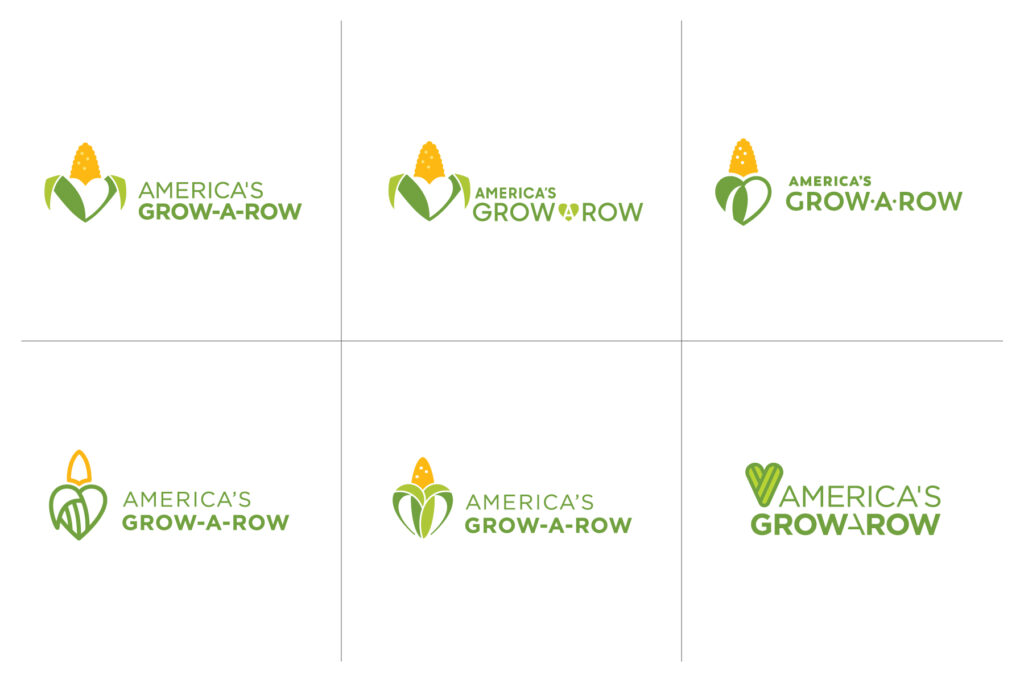
We refined the mark by rebuilding it with intention, not changing its meaning.
We began by placing the existing icon on a grid and examining spacing, proportion, line quality, and balance. By deconstructing the mark, we could rebuild it with intention. We refined the corn and heart shape, adjusted the line work, improved balance and consistency, and updated the typography and colors for legibility and flexibility.
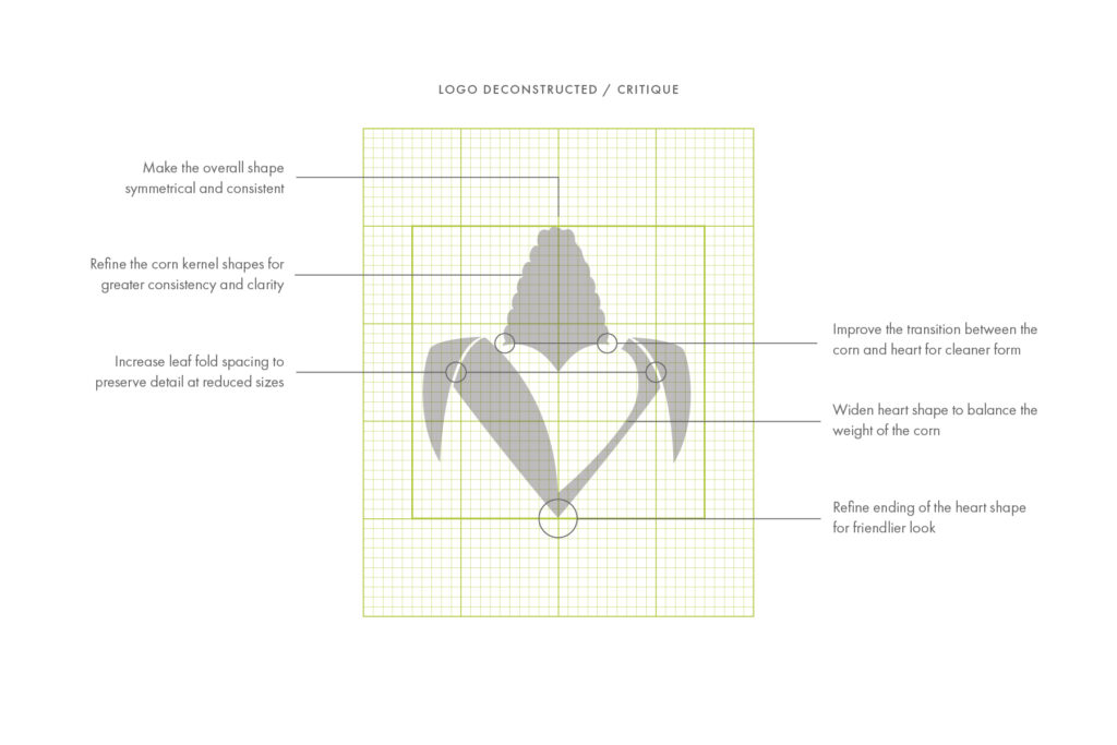
We pushed the options until the solution became clear.
We explored a wide range of concepts, from gentle refinements to more “out there” ideas because good design requires exploration. As we suspected, the strongest solution wasn’t a reinvention. It was an evolution.
A logo doesn’t live on a slide deck. It lives on hats, signage, websites, donor materials, social posts, and, in this case, even tractors. We tested the evolved mark across real-world applications and built a flexible system of logo options, sizes, and formats. Now, AGAR’s team and vendors have clear direction and the freedom to execute confidently. They no longer have to make workaround design decisions on the fly. The system does the heavy lifting.
A sustainable brand for the next 25 years.
As the new brand rolls out, America’s Grow-a-Row can show up the way it operates — as a mature, well-run organization with heart at its core. The soul is still there. Now it’s supported by structure.
The most important decision AGAR made wasn’t approving a new logo. It was choosing to trust experts to evolve something deeply personal, in service of a mission that had outgrown its original mark.
That decision is where meaningful marketing begins.


Bethlyn Krakauer is i.e. design’s Founder and Creative Director.